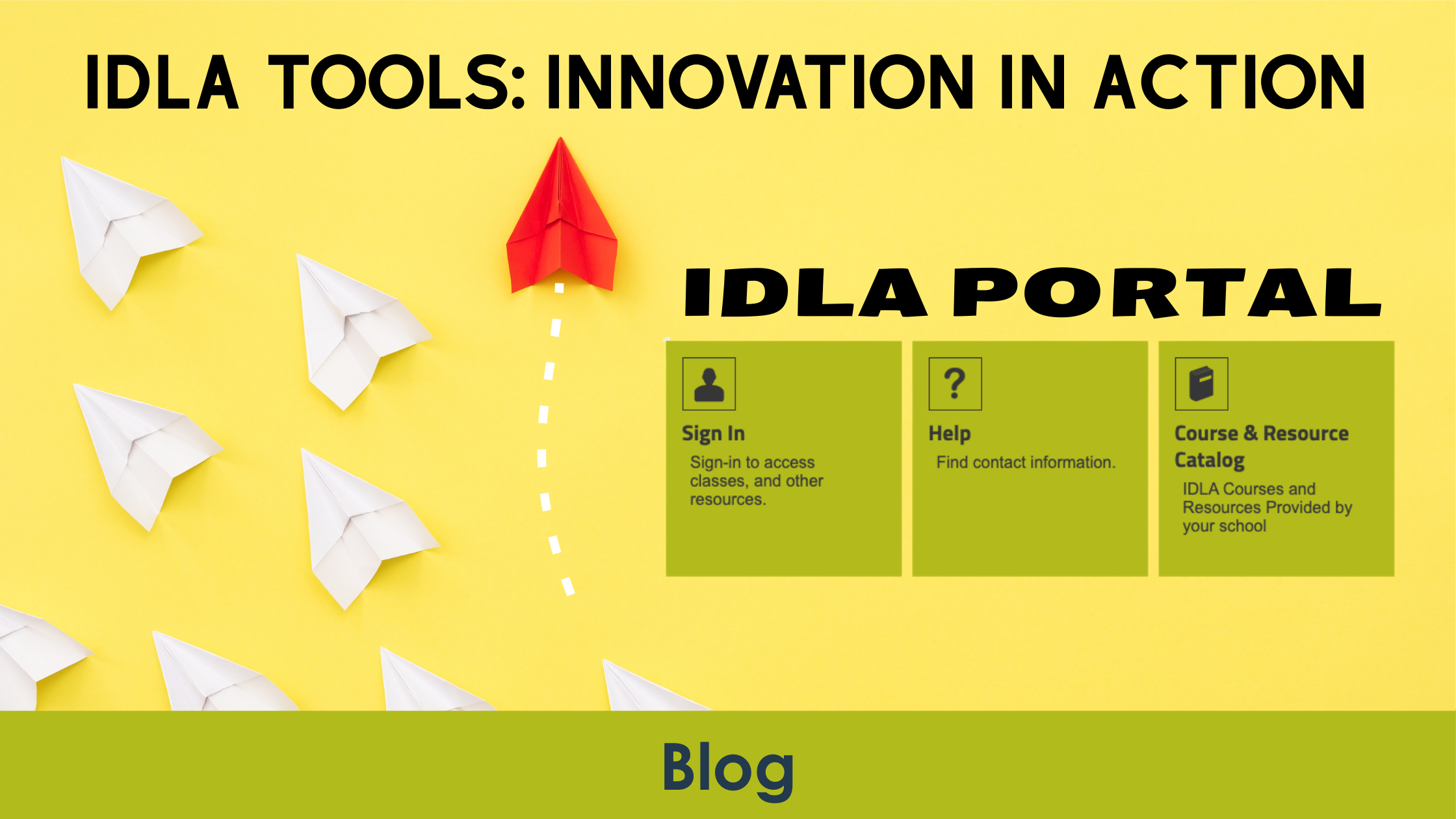
Tool: Portals
The Friction
Modern education lives online, but it often lives in many places at once.
Assignments, grades, messages, feedback, and resources may all exist behind different logins. For students, the day can begin not with learning, but with navigating. Which platform holds the assignment? Where is the feedback? Which password works today?
None of these questions are academic, yet they consume attention before a lesson even begins. When students must think about the system before they can think about the content, complexity becomes a quiet barrier.
The problem was not a lack of tools. Schools had plenty. The friction came from fragmentation. Each system solved a need, but together they created too many doors.
Cognitive energy is limited. Every moment spent figuring out where to click is energy not spent understanding the lesson. The digital campus had grown, but it had not grown together.
Inside the Design Room
When the idea for Portals took shape, the guiding question was deceptively simple: what would a single doorway look like?
The design team did not begin by asking what new features to add. They asked what could be simplified. What could be unified. What could fade into the background.
Portals was envisioned as a central access point, a consistent entryway where students could begin their day without hesitation. Instead of navigating a maze of links, students would step through one door and find what they needed.
Designing something that feels effortless is rarely effortless itself. It requires discipline. It requires restraint. It requires imagining the student experience from the first click to the final submission and removing every unnecessary step along the way.
Portals became the connective tissue of the digital environment. A streamlined pathway rather than a scattered map.
What Changed
With Portals in place, students no longer start their day searching. Access is centralized. Navigation is intuitive. The system feels cohesive instead of layered.
The shift is subtle but powerful. When the platform becomes invisible, learning moves to the foreground.
Students spend less time remembering where to go and more time focusing on what they are there to do. Teachers spend less time troubleshooting access issues and more time teaching.
The digital campus begins to feel like a campus, not a collection of disconnected rooms.